
Wind analysis
The Wind analysis page studies the wind regime of one or more wind turbines over a selected period: how often the wind blows from each direction, how strong it is, how it distributes across speed classes and how well it fits a Weibull model.
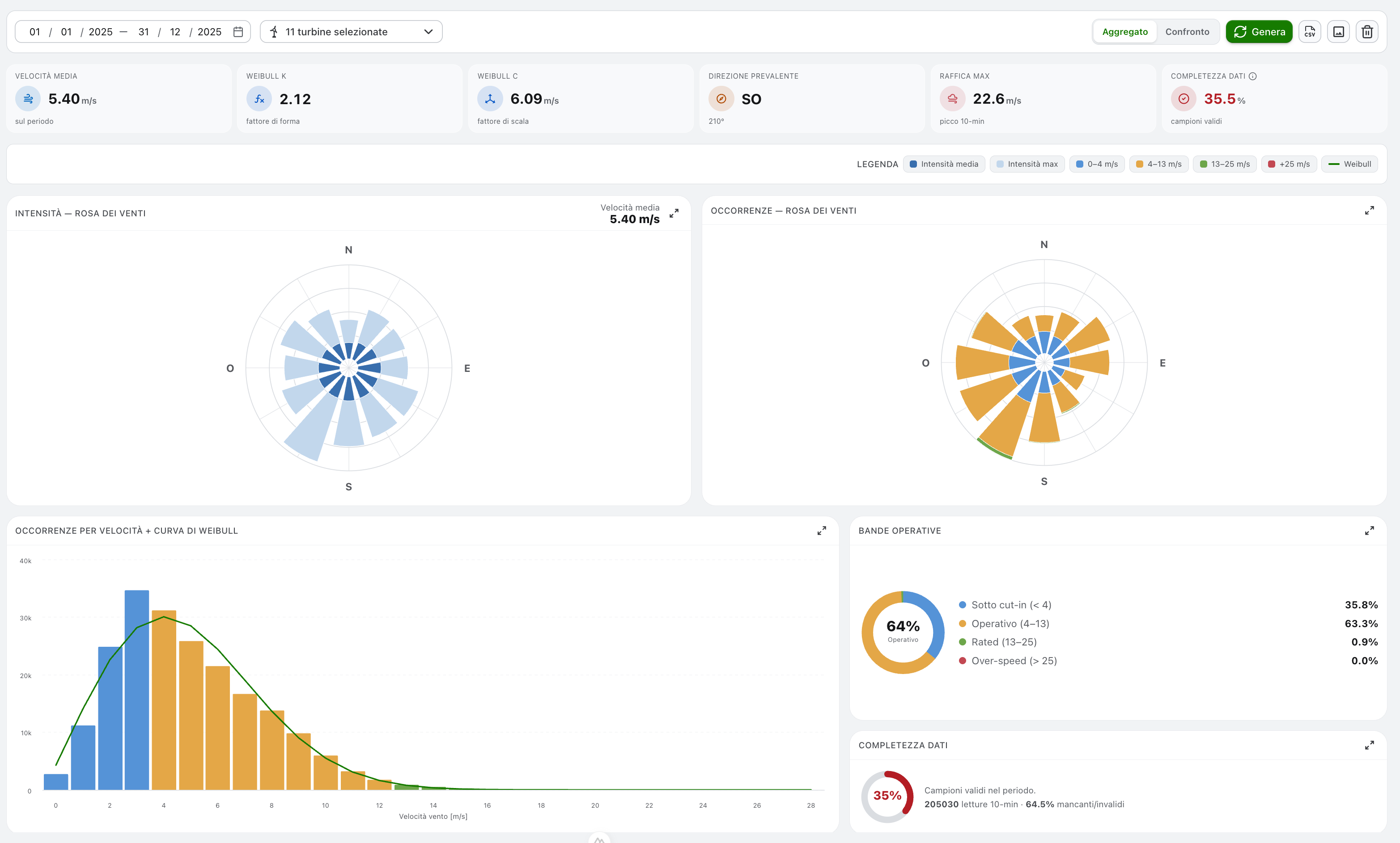
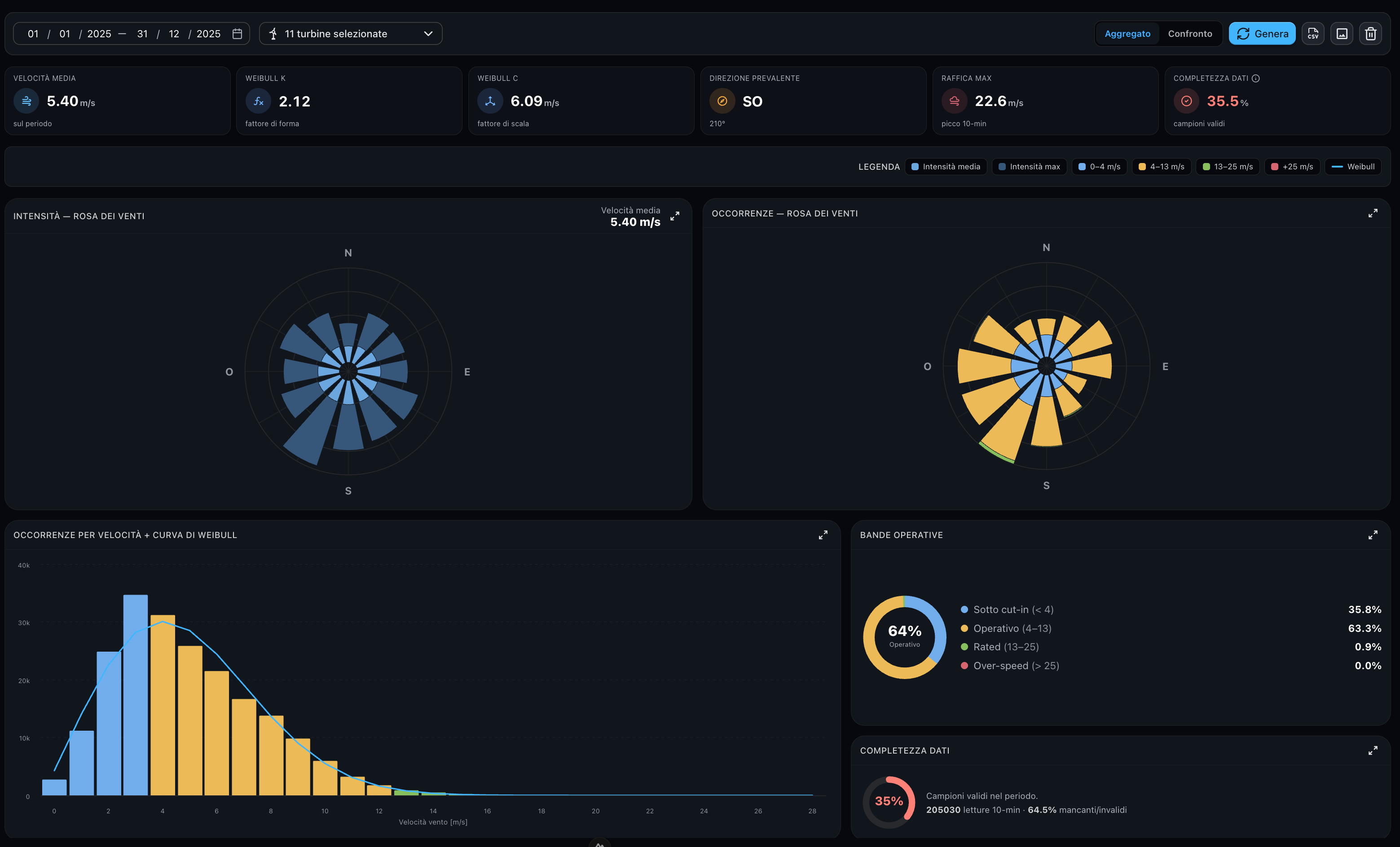
It reads the 10-minute averaged wind speed and direction recorded by each turbine and builds:
- two wind roses — by intensity and by occurrence per direction sector;
- the speed histogram with the fitted Weibull curve;
- the split into speed bands and the data completeness;
- a per-turbine comparison with three layouts.
— as prevailing direction).Toolbar
On the left:
- Period — start/end date-time range.
- Turbine selection — a device tree restricted to wind turbines, with multi-selection down to the single turbine. Selecting a plant or a group selects all the turbines underneath it.
On the right:
- Aggregate / Compare — switches between the aggregate dashboard and the per-turbine comparison.
- Generate — runs the analysis for the selected turbines and period. While loading, a progress banner reports the turbine being read. If you change turbines or dates after a run, an orange dot on the button reminds you that the result on screen no longer matches the current selection.
- Export CSV / Export PNG — download the data or a snapshot of the charts (see Exports).
- Clear — discards the current result.
Summary indicators
A strip of six cards summarises the selection (a single turbine or all of them together).


- Average wind speed over the period and max gust (highest 10-minute average).
- Weibull k (shape factor) and Weibull C (scale factor) of the fitted distribution.
- Prevailing direction on the 8-point compass — the sector with the most readings.
- Data completeness — share of valid 10-minute samples over the period.
How completeness is computed
- The expected sample count covers only the elapsed part of the period: a range ending in the future (e.g. today) is evaluated up to the current time, so it is not penalised.
- A sample is valid only when both speed and direction are valid at the same timestamp.
- With more than one turbine, the aggregate completeness is the average of the single turbines' completeness — all the other aggregate figures are computed on the merged samples.
The value is coloured by threshold:
| Colour | Threshold | Meaning |
|---|---|---|
| Green | ≥ 90 % | Good |
| Amber | 75 – 90 % | Acceptable |
| Red | < 75 % | Poor |
The same colours are applied to the completeness column of the comparison table.
Wind roses
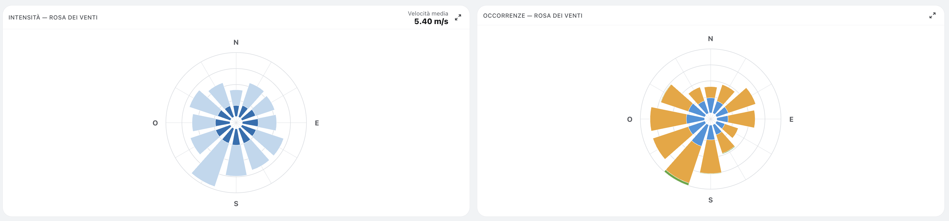
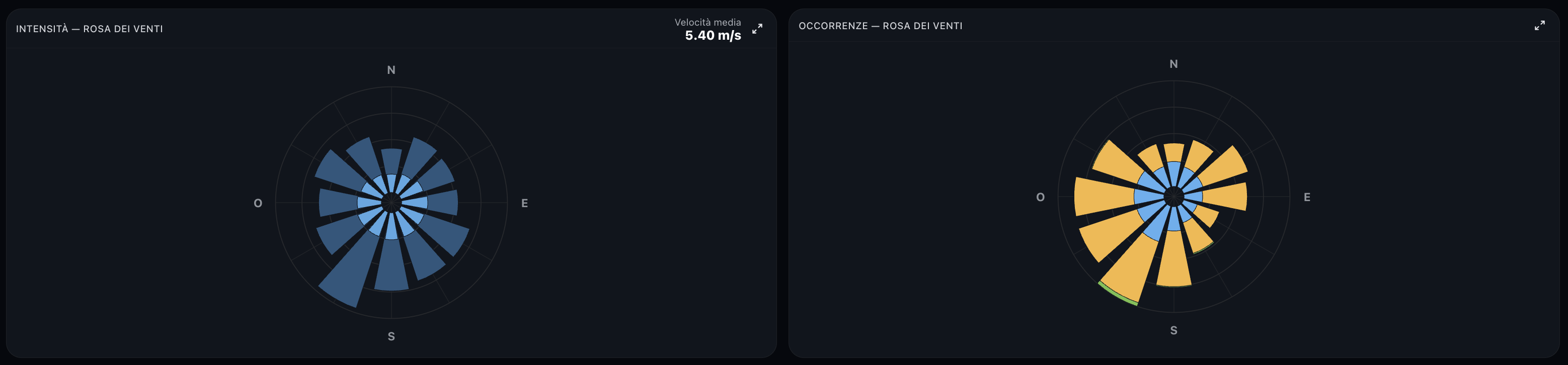
The horizon is split into 12 direction sectors of 30°, centred on the compass points (the N sector covers 345°–15°; N at the top, clockwise).
- Intensity rose — for each sector, the average wind speed (inner wedge) and the maximum (outer wedge).
- Occurrence rose — how many readings fell in each sector, stacked by speed band.
The speed bands follow the typical turbine power curve: below cut-in (0–4 m/s, the turbine does not produce), operating (4–13 m/s), rated (13–25 m/s, nominal power) and over-speed (> 25 m/s, safety cut-out). A reading exactly on a boundary belongs to the upper band.
Hovering a sector shows its exact values in a tooltip.
Speed distribution & Weibull
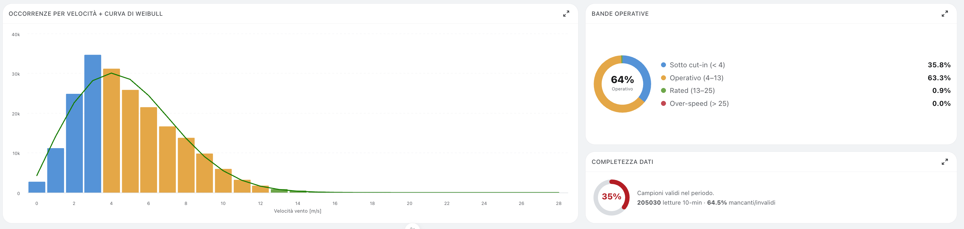
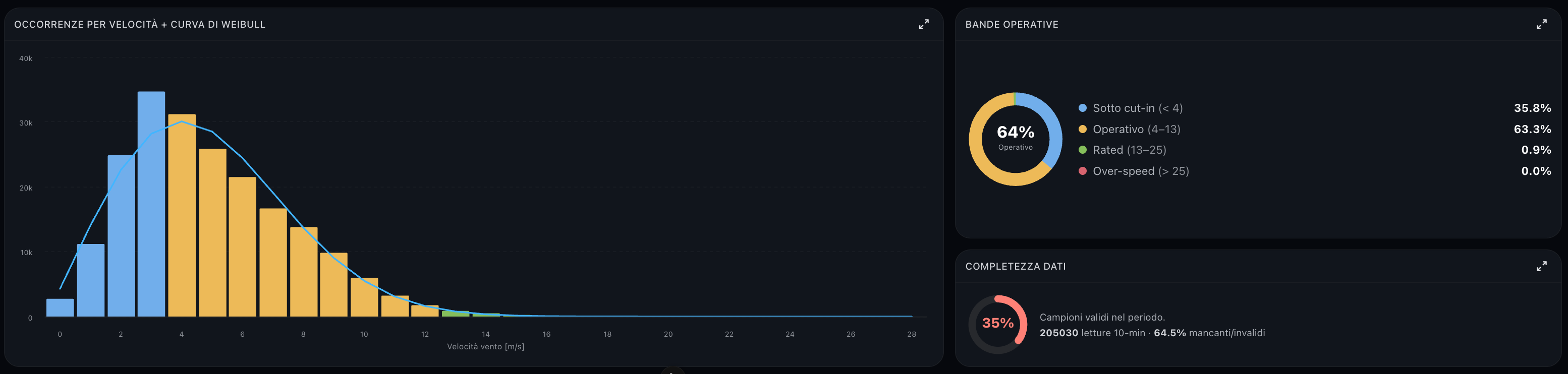
The histogram counts the readings in 1 m/s classes, coloured by band; the last class is open-ended and collects everything above it (≥). The continuous line is the Weibull probability density fitted to the data and scaled to the counts:
f(v) = (k / C) · (v / C)k−1 · e−(v / C)k
where k and C are the shape and scale factors shown in the indicators, estimated empirically from the mean and standard deviation of the measured speeds.
Next to it:
- the speed bands donut splits the readings into below cut-in, operating, rated and over-speed, with the share of time in the producing bands at the centre;
- the data completeness ring reports the share of valid 10-minute samples.
Interacting with the charts
- A single Legend bar drives every chart: click a series — intensity avg/max, a speed band or the Weibull curve — to show or hide it across all charts at once. The wind roses, the histogram, the donut and the mini-roses in the comparison table update together; the donut percentages are re-normalised over the visible bands.
- Every chart card has a fullscreen button; press
Escto exit. - All the roses share the same hover tooltip with per-sector values; on the donut it shows each band's share.
Compare turbines
The Compare view puts the selected turbines side by side. The Layout switch offers three arrangements (the grid is the default):
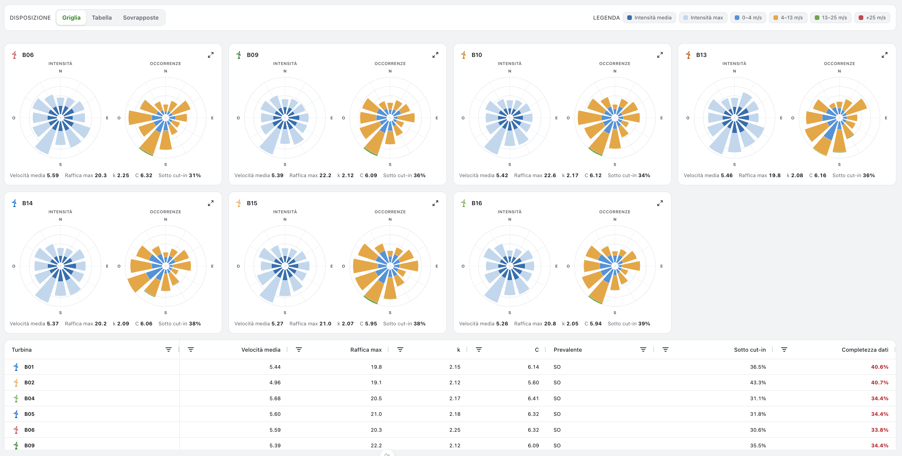
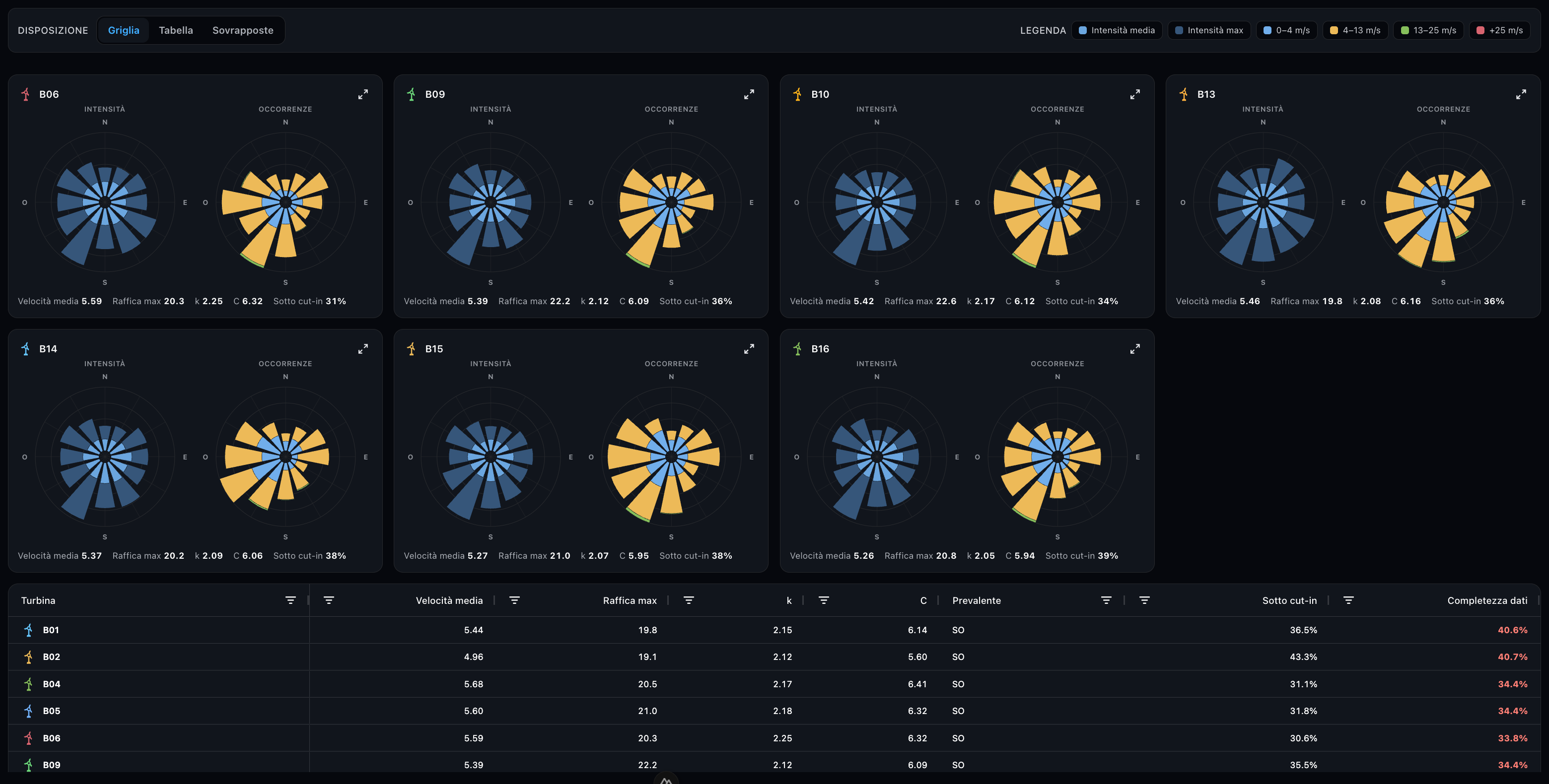
- Grid — a card per turbine with both wind roses and the key figures, laid out as a carousel: one row by default, arrows and page dots to browse, and a drag handle below to reveal up to three rows. The comparison table sits underneath.
- Table — one row per turbine with inline mini-roses and all the numbers, filling the page height with its own internal scroll. Columns can be sorted and filtered Excel-style (multi-value list on turbine and direction, numeric conditions on the figures) and filters apply in cascade.
- Overlaid — the turbines drawn as coloured lines on two shared roses (average intensity and occurrences), for an immediate directional comparison. The legend is replaced by the turbine list: click a turbine to hide or show its line; hovering a sector shows every turbine's value at once. The comparison table appears below the roses, filling the remaining page height.
The comparison table keeps the Aggregate row pinned at the bottom like a footer: it stays visible whatever the sorting, filtering or scrolling. The completeness column is coloured by the thresholds above.
Exports
- CSV — follows the active view: in Aggregate it exports the aggregate indicators only, in Compare one row per turbine plus the aggregate (average and max speed, Weibull k and C, below cut-in %, completeness, sample count). A second section breaks down the aggregate rose per sector (occurrences per band, average and max speed). Column separator and decimal symbol follow the application language (
;with comma decimals in Italian,,with point decimals in English), so the file opens cleanly in your local Excel. - PNG — downloads a single image with all the charts of the current view (tables are excluded). It is disabled in the Compare · Table layout, where there is nothing to capture but the table.