Dashboard
The Dashboard page allows you to manage the dashboard templates used in the platform. Each displayed dashboard is generated from a template — a reusable layout that defines which widgets to show and how they are positioned on a grid.
Template types
There are two types of templates:
- Default templates: fallback used when no custom template is assigned. One per combination of asset (plant/device) and type (solar/wind/generic);
- Custom templates: user-created. Can be assigned to specific entities to override the default.
Filter
A plant filter is available in the page header. By selecting one or more plants:
- The list shows only templates that have at least one assignment to the selected plant or one of its devices;
- The assignment counter of each template is recalculated considering only the entities of the selected plant.
Default templates
Default templates are displayed as cards with a preview of the layout, split into two rows: Plant and Device. There is one default template for each technology type (solar, wind, generic).
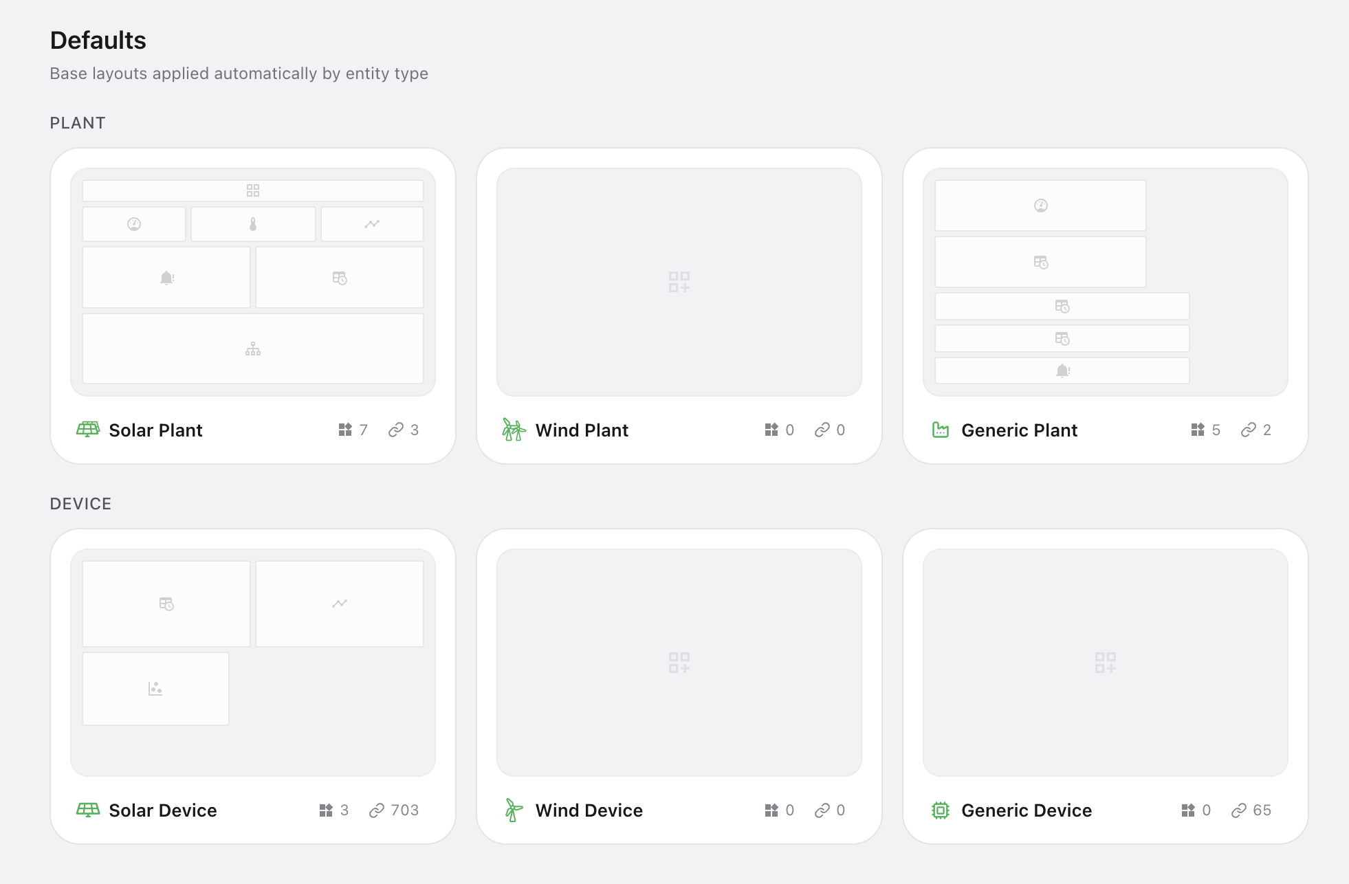
They cannot be deleted or renamed. Available actions:
| Action | Description |
|---|---|
| Edit | Opens the template in the visual editor to modify the widget layout |
| Copy | Enters copy mode — click another template to overwrite its layout, or click Duplicate to create a custom template with the same layout |
| Export | Downloads the template as a JSON file |
| Assignments | The popover on the assignment counter in the card shows which entities the template is currently assigned to (view only) |
Hovering over a card reveals quick-action buttons for edit, copy, and export.
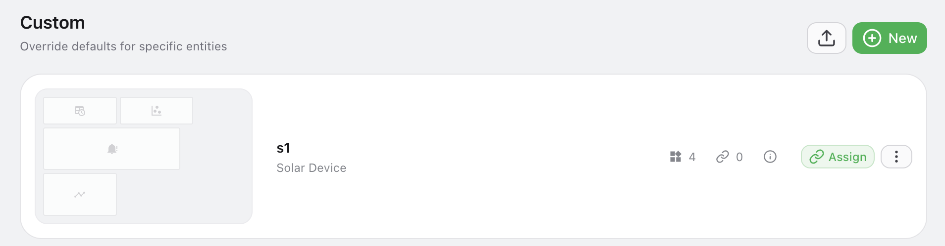
Custom templates
Custom templates are listed as rows below the defaults section. Each row shows name, category, widget count, assignment count, and creation/update dates.
Creating a template
Two buttons are available in the section header:
- Import — uploads a previously exported JSON file to create a new template;
- New — opens a modal to select asset (plant/device), type (solar/wind/generic), and enter a name. After creation you are redirected to the editor.
Actions on a single template
| Action | Description |
|---|---|
| Edit | Click on the row to open the template in the visual editor |
| Copy | Enters copy mode — click another template to overwrite its layout, or click Duplicate to create a standalone copy |
| Assign | Click the Assign button on the row to link the template to specific entities |
| Export | Downloads the template as a JSON file |
| Delete | Removes the custom template from the context menu |
Template editor
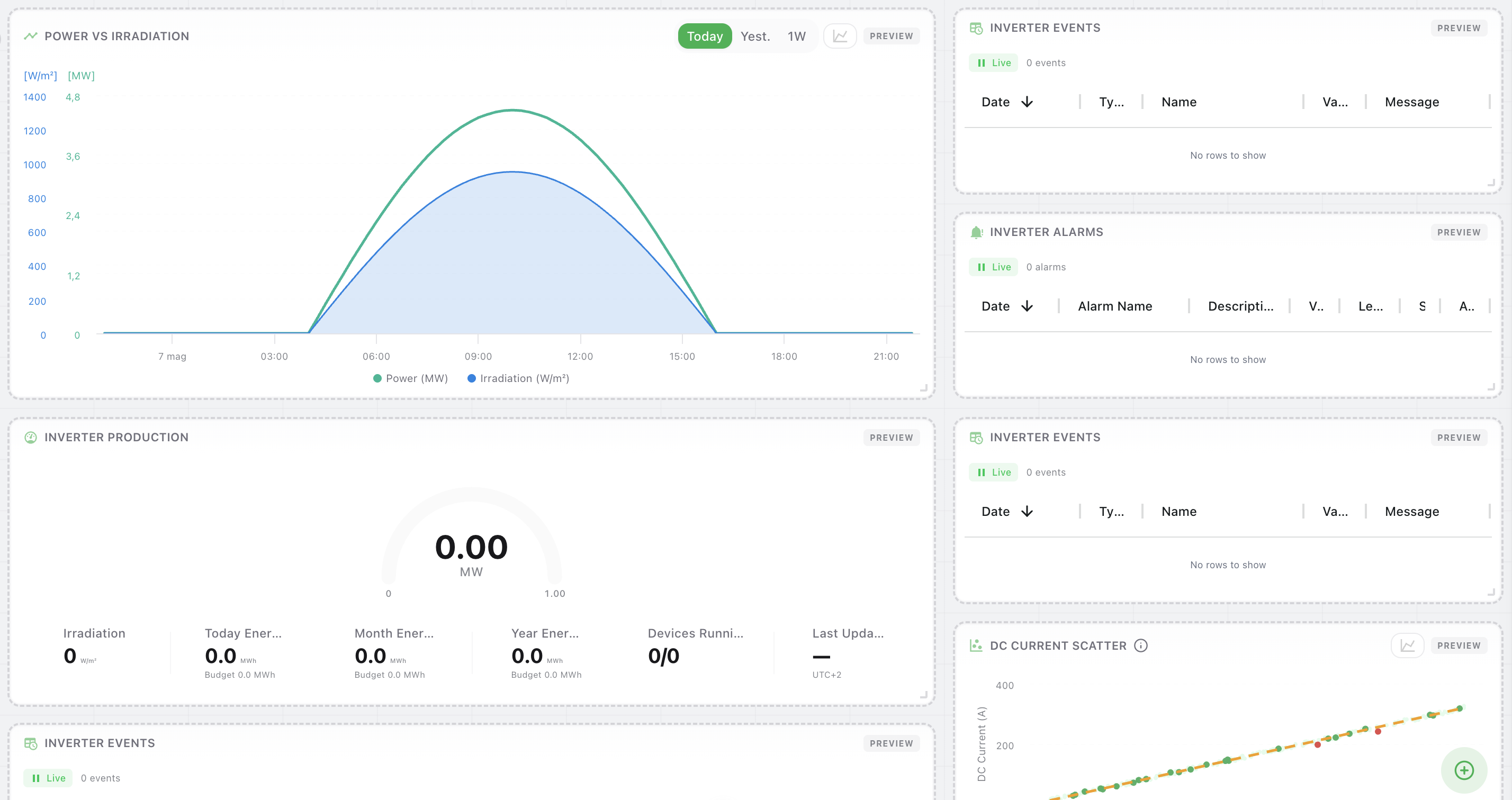
Clicking Edit opens the visual editor — a grid canvas where you can design the dashboard layout.
Grid
The editor uses a fixed 16-column grid. Widgets are positioned and sized in column/row units. The first 16 rows fill the viewport; content beyond scrolls vertically.
Adding widgets
- Click the button (FAB at the bottom-right) to open the widget catalog sidebar
- Hover over the desired widget to reveal the button on the right
- Click the button to add the widget at the first available position on the grid
Alternatively, drag a widget from the catalog and drop it directly on the grid to position it where you prefer.
Widget catalog
The catalog lists all available widgets grouped by category:
| Category | Examples |
|---|---|
| Monitoring | Production gauge, device status grid, sensors |
| Performance & KPI | Performance ratio, efficiency, equivalent hours, ranking, revenue |
| Charts & Analysis | Power vs irradiation, DC current scatter, heatmap, power curve |
| Events & Diagnostics | Event log, alarm log, harmonics, data completeness, clipping analysis |
| Utility | Synoptic, embedded content, operative notes |
Widgets are scoped to either plant or device level. The catalog only shows widgets compatible with the template's asset type.
Editing widgets on the canvas
| Interaction | Description |
|---|---|
| Click | Selects the widget (highlighted with a border) |
| Double-click | Opens the widget settings panel |
| Drag | Moves the widget on the grid |
| Resize handle | Drag the bottom-right corner to resize (respects min/max constraints) |
| Right-click | Context menu: settings, copy, duplicate, delete |
Widget settings
With a widget selected, the right sidebar shows its configuration options. Available settings depend on the widget type (e.g. URL for embedded widgets, time range for scatter plots).
Keyboard shortcuts
| Shortcut | Action |
|---|---|
| ⌘Z | Undo |
| ⌘⇧Z | Redo |
| ⌘S | Save |
| ⌘C | Copy selected widget |
| ⌘V | Paste widget |
| ⌘D | Duplicate selected widget |
| Delete / Backspace | Remove selected widget |
| Esc | Close panel / deselect |
Saving
A floating toolbar appears when there are unsaved changes:
- Save — persists the changes to the server
- Cancel — reverts to the last saved state
Template assignment
Each template can be assigned to one or more specific entities (plants or devices). To manage assignments:
- Click the Assign button on the template card or row
- In the assignment panel, add or remove entities
Resolution logic
When a user opens the dashboard of an entity, the system resolves the template in this order:
- Explicit assignment — if the entity is assigned to a custom template, that template is used
- Default template — otherwise, the default template matching the entity's asset and type is used
- Empty dashboard — if no match is found
This allows different entities of the same type to display different dashboard layouts.