Asset Overview
The Asset Overview page is the main landing after login. It provides an overview of all plants configured in the system.
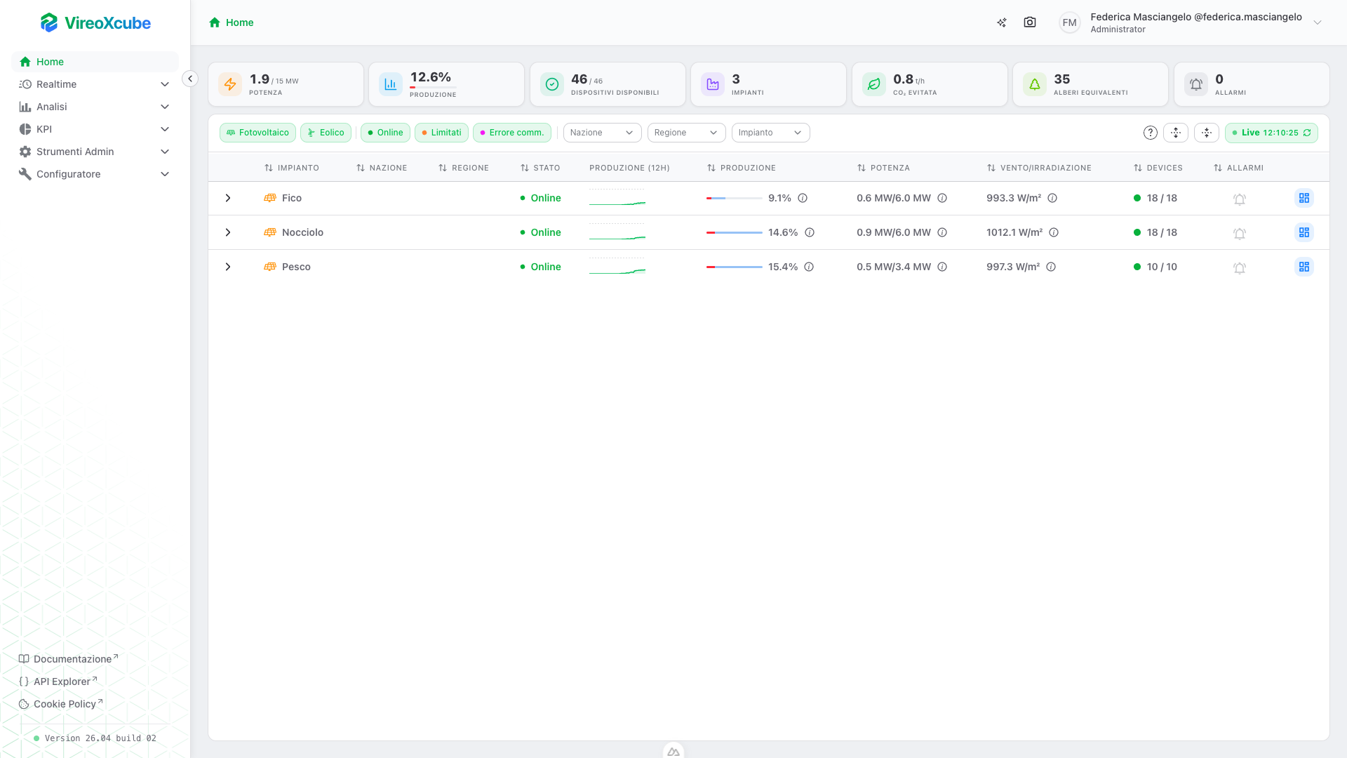
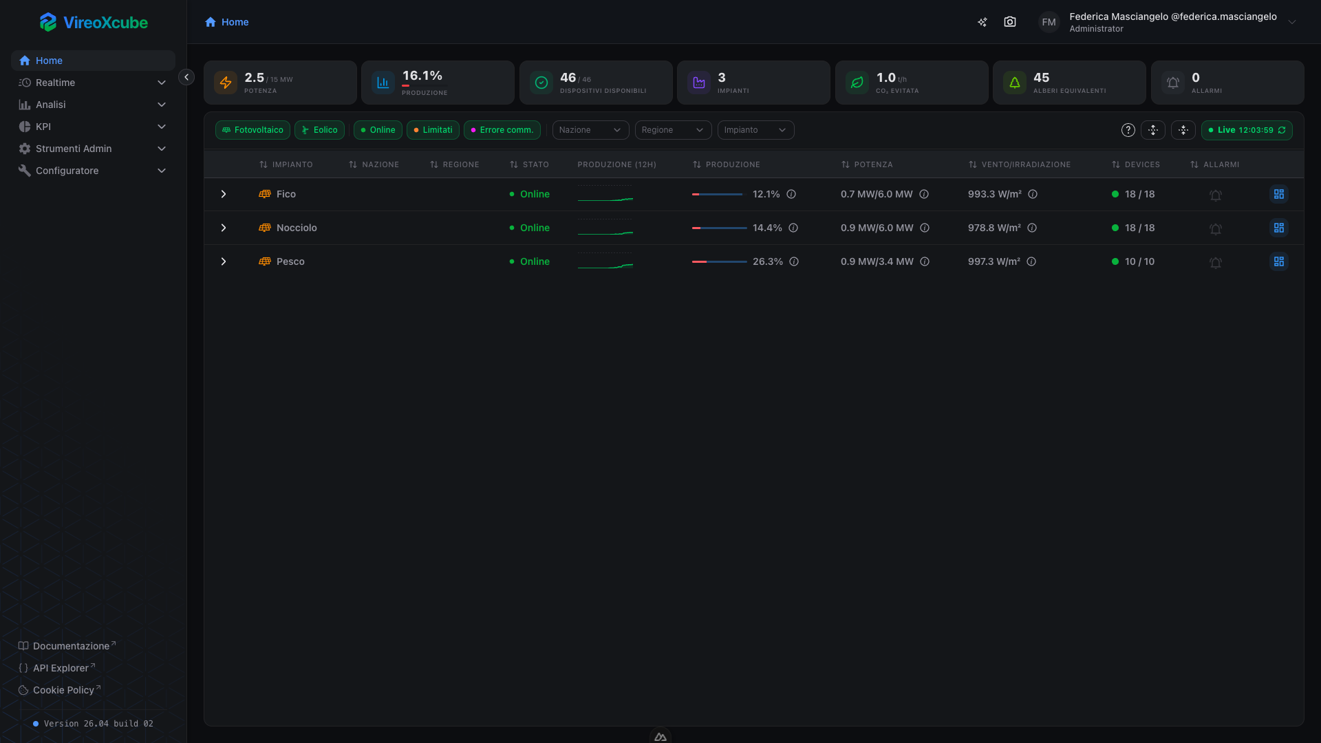
For every plant you see:
- Name;
- Country and region;
- Overall plant status;
- Production chart (12h);
- Production percentage;
- Active power vs nominal;
- Irradiation or wind speed, depending on the plant type;
- Number and state of devices;
- Active alarms;
- Link to the realtime dashboard.
Data refreshes automatically every 15 seconds.
Global KPIs
A bar at the top of the page always shows the aggregated values:


| KPI | Description |
|---|---|
| Active Power | Total MW currently produced / MW nominal. |
| Production % | Production percentage vs nominal capacity. |
| Available Devices | Devices in RUN or READY state, out of total. |
| Plants | Total number of monitored plants. |
| CO2 Avoided | Tons of CO2 avoided per hour. |
| Trees Equivalent | Tree equivalent of avoided CO2 per year. |
| Alarms | Total number of active alarms; the badge pulses when any exist. |
Filters and search
The toolbar below the global KPIs includes:
Filter chips


| Filter | Shows |
|---|---|
| Photovoltaic | Photovoltaic plants. |
| Wind | Wind plants. |
| Online | Plants in online state (all devices operational). |
| Limited | Plants with an active production limitation. |
| Comm Err | Plants in communication error. |
Select filters:


| Filter | Shows |
|---|---|
| Country | Plants filtered by the selected countries. |
| Region | Plants filtered by the selected regions. |
| Plant | Plants filtered by the specific selection. |
Filters have a hierarchical constraint Country -> Region -> Plant.
- Changing the country selection automatically resets the region and plant selections;
- Changing the region selection resets the plant selection.
The Clear filters button resets all filters to their initial state: country, region and plant selections are emptied, and filter chips are restored to default.
Status legend ( ):
Opens a popover with the list of all possible device states, each with its identifying color. States are listed in descending priority order (most critical first): FAULTED, MANUAL_STOP, MAINTENANCE, COMM_ERROR, AUTO_STOP, READY, RUN. This order reflects how the aggregate state of each plant is computed.
Expand / Collapse ( / ):
Expands or collapses all rows at once.
Live button:
The Live button in the toolbar shows in real time the connection status to the data and the timestamp of the last successful refresh. It is always visible on the right of the toolbar and can be clicked to force an immediate refresh.
| Color | Condition |
|---|---|
| Green | Data is up to date — the last polling cycle completed successfully within the expected time. |
| Red | Data is considered stale — no successful refresh for more than 30 seconds (two consecutive failed polling cycles). |
Plants table
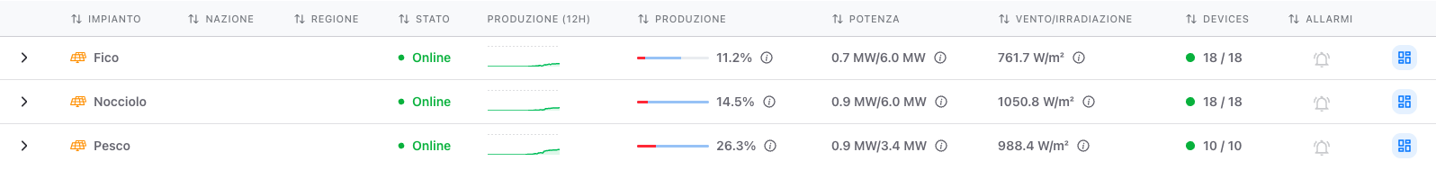
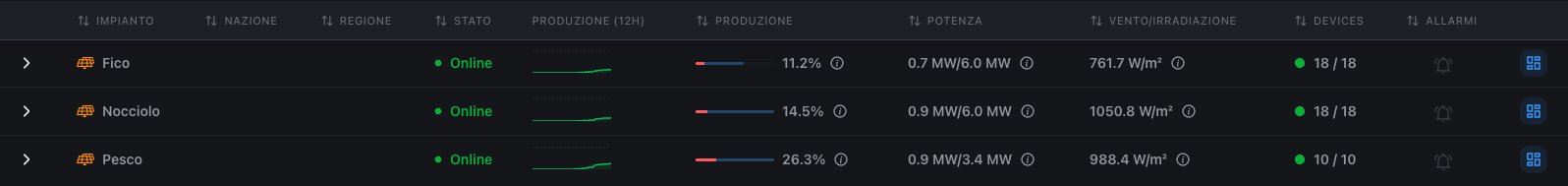
Status column
The Status column shows the overall connectivity and operational state of the plant, represented by a colored dot followed by a text label. Unlike the Devices column (which reflects the device-level aggregate by priority), here the state is reduced to three high-level categories designed to give an immediate at-a-glance reading of plant health.
| Dot | State | When it is shown |
|---|---|---|
| Green | Online | The plant is communicating correctly and has no active production limitations. This is the normal behaviour. |
| Orange | Limited | The plant is communicating normally, but an active production limitation is in place. |
| Violet | Comm Error | The plant is in full communication error: all monitored devices are unreachable. Signals a critical problem that requires immediate attention. |
Difference from the device state:
This column does not reflect states like FAULTED, MAINTENANCE or MANUAL_STOP of individual devices: for that level of detail, refer to the Devices column (where the dot color follows the full device-state hierarchy) or expand the plant row to see the card of each individual device.
Production (12h) column
The Production (12h) column shows, for each plant, a miniature chart (sparkline) of the active power trend over the last 12 hours. It is designed to provide an immediate reading of the recent trend — increases, drops, stops, irregularities — without opening a dedicated dashboard.
What the sparkline shows:
- Green line with a translucent filled area: the active power trend over time (12h of history);
- Horizontal dashed line (when available): the plant's nominal power level, used as a theoretical maximum reference. The vertical axis of the chart is scaled on the nominal power + 10% headroom, so the curve's position immediately communicates how much the plant is producing relative to its maximum capacity. If the nominal value is missing, the axis is scaled to the maximum of the historical data;
- No data: if the history contains fewer than two points, a simple dash is shown instead of the chart to indicate the absence of data.
Hovering the sparkline:
- A vertical dashed line follows the pointer and identifies the closest time point;
- A position dot is drawn on that point;
- A tooltip appears below the chart with:
- the exact power value in MW at that moment;
- the timestamp of the point.
Each point of the history carries a validity flag. When hovering on a non-valid point (typically caused by a communication interruption at sampling time):
- The hover dot is violet instead of green;
- The tooltip displays the label
Not Validin violet, in place of the numeric value.
This lets you immediately tell actual production drops from communication gaps, even when quickly scrolling through the table.
Production column
The Production column shows, for each plant, the instantaneous production percentage compared to the theoretical producible power at that moment. The goal is to immediately show how much the plant is producing relative to how much it could actually produce given current conditions (weather, limitations, operability), independently of the maximum nominal power.
What the cell shows:
- Two-layer bar:
- a translucent blue background showing the percentage of producible power vs the plant's nominal — how much could realistically be produced at that instant;
- a solid fill on top showing the percentage of active power actually being produced vs the nominal;
- Numeric label next to the bar, in the production percentage format;
- Info icon that opens a popover with the exact MW values of both active production and producible.
Dynamic colors of the production bar:
The color of the solid fill changes based on the ratio between active power and producible power (not vs the nominal).
| Color | Active / producible ratio | Meaning |
|---|---|---|
| Green | > 70% | The plant is producing at (or near) the maximum the current conditions allow. |
| Amber | between 30% and 70% | The plant is producing below target. |
| Red | ≤ 30% | The plant is producing much less than it could. |
| Gray | Producible unavailable | The producible value is missing or null. |
Power column
The Power column shows the plant's real-time active power, compared with its maximum nominal power. It is the reference column for reading the absolute values in MW and for assessing how much each plant is contributing in net terms to the total production.
What the cell shows:
- Main value in the format
active power MW / nominal power MW, with one decimal:- the first value is the instantaneous active power being produced at this moment;
- the second is the plant's nominal power, i.e., the maximum installed capacity (fixed reference);
- Info icon that opens a detailed tooltip about the source of the data.
| Color | Condition |
|---|---|
| White (default) | Valid measurement: the data was received recently from the realtime system. |
| Amber | Stale measurement: the last update is older than 2 hours. The value may not reflect the actual situation. |
Clicking the info icon next to the value opens a popover with traceability information about the tag providing the measurement:
| Field | Description |
|---|---|
| Last update | Date and time of the last reading received for the active power tag. If the data is stale it is shown in amber, with an explicit warning at the top ("Old measurement > 2h"). |
| Tag path | Full hierarchical path of the tag in the device tree. Useful to understand from which device / section the data is physically read. |
| Tag | Unique technical identifier (UUID) of the tag. Useful to advanced users or for references in support tickets. |
| Message | Service message attached to the data, typically describing the cause of any communication anomalies. |
Wind / Irradiation column
The Wind / Irradiation column shows the most relevant meteorological value for the plant type, i.e., the environmental variable that determines the instantaneous production capability. It is a key parameter for interpreting current production: it helps to understand whether a plant producing little is doing so for physiological reasons (less wind, less sun) or for a real underperformance.
The content of the cell depends automatically on the plant type:
| Plant type | Displayed quantity | Unit of measurement |
|---|---|---|
| Wind | Wind speed | m/s |
| Photovoltaic | Solar irradiation | W/m² |
| No data available | Single dash — | — |
The color of the text signals the freshness of the measurement:
| Color | Condition |
|---|---|
| White (default) | Valid measurement: the data was received recently from the realtime system. |
| Amber | Stale measurement: the last update is older than 2 hours. The value may not reflect the actual situation. |
Clicking the info icon next to the value opens a popover with the traceability information about the tag providing the measurement:
| Field | Description |
|---|---|
| Last update | Date and time of the last reading received for the tag. If the data is stale it is highlighted in amber, with an explicit warning at the top ("Old measurement > 2h"). |
| Tag path | Full hierarchical path of the tag in the device tree, useful to understand from which station / sensor the meteo data is physically read. |
| Tag | Unique technical identifier (UUID) of the tag. |
| Message | Service message attached to the data, typically describing the cause of any anomalies. |
Devices column
The Devices column shows the availability of the plant's devices (inverters, turbines, etc.) together with a colored dot reflecting the aggregate state of those devices.
What the cell shows:
- Colored dot (on the left): aggregate state of the plant's devices, computed in decreasing priority of criticality.
- Numeric ratio in the format
available / total:- Available: number of devices in
RUNorREADYstate. - Total: overall number of devices monitored for that plant.
- Available: number of devices in
The dot takes the color of the plant's aggregate state, computed by priority as defined in the Status legend tooltip.
Alarms column
The Alarms column immediately signals the presence of active alarms on the plant and also acts as a navigation shortcut to the alarms page filtered by that specific plant.
What the cell shows:
- Bell-shaped icon at the center of the cell, always present;
- Red numeric badge attached at the top right of the icon, visible only when there are active alarms, indicating the total number of alarms.
Dashboard column
The last column on the right, without a header, is a quick access button to the plant's realtime dashboard. It serves as a direct operational shortcut, for when the operator wants to dig deeper into the situation of a specific plant without scrolling through other views or menus.
On click, the system navigates to the realtime Dashboard of the selected plant, i.e., the page /realtime/dashboard/{id} where {id} is the unique identifier of the plant on that row. There the operator finds all the real-time detailed information — metrics, devices, charts, synoptic — of the plant.
Devices section
Clicking the arrow on the left of a row, the plant expands revealing a section dedicated to the devices it is made of. This is where you switch from the aggregated view to the detailed view: you see every inverter, turbine or meter with its state and its instantaneous production, grouped in an orderly fashion.
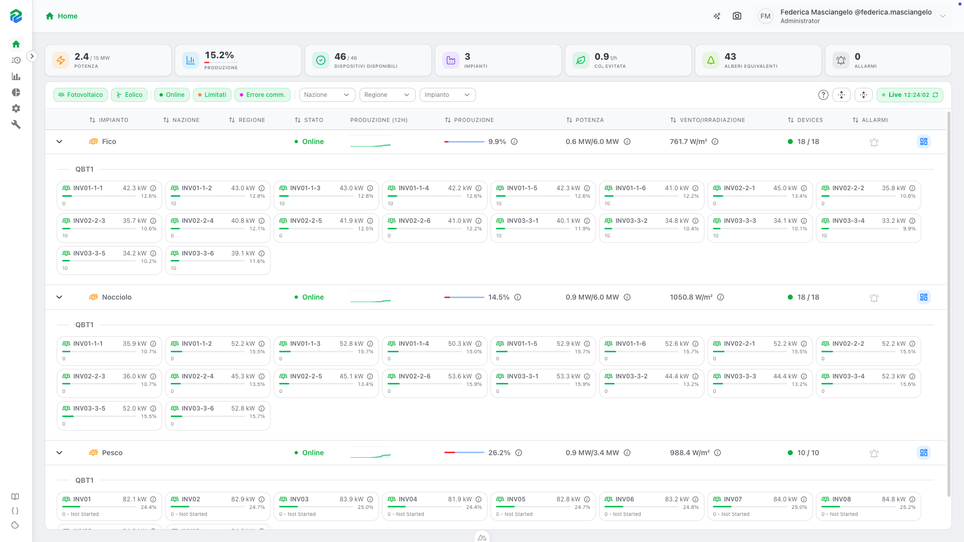
Panel structure:
Devices are grouped by section of the plant (the section is the electrical distribution line or functional area the device belongs to). Each group is separated by a row with the section name in bold. Devices with no assigned section end up in a dedicated group labelled Unassigned.
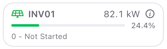
Each card represents a device of the plant and shows:
| Element | What it shows |
|---|---|
| Type icon | Symbol identifying the type of device. The icon color reflects the device state. Hovering shows a tooltip with the textual state label. |
| Device name | Readable identifier of the device, truncated with ellipsis if too long. |
| Active power | Instantaneous power value produced by the single device, expressed in kW with one decimal. |
| Info icon | Opens a tooltip with timestamps of the realtime data traceability. |
| Production bar | Thin bar representing the active power as a percentage vs the device's nominal. |
| Production percentage | Numeric percentage next to the bar, or the dash — if the device is not producing. |
| Event message | Descriptive text of the event or anomaly currently in place on the device. |
Realtime information tooltip:
Clicking the info icon next to the device's power opens a tooltip with three traceability timestamps:
| Field | Description |
|---|---|
| Device status last update | Date and time of the last reception of the device state. |
| Active power last update | Date and time of the last reception of the active power value. |
| Event last update | Date and time of the last reception of the event / operational message related to the device. |
Navigation to detail:
Clicking any part of the card (except the info tooltip and the status icon) opens the realtime dashboard of the single device. This is the fastest way to dig into a specific device when you spot an anomaly in the expanded panel.
Frequently asked questions
Why don't I see all my plants?
The Home page only shows plants included in your assigned zones. Contact the administrator to verify your zone assignments.
Why does a plant show a violet dot next to the devices count?
It means at least one device of that plant has a communication error. The violet dot appears even if the plant's overall state is different (e.g., RUN or MAINTENANCE), to give immediate visibility of connectivity issues.
What does "producible" mean in the production bar?
The producible is the power the plant could currently produce given the weather and operating conditions. Comparing active production to the producible tells you how close the plant is running to its real-time maximum, independently of the nominal power.
Can I refresh data without waiting for the 15-second cycle?
Yes, click the Live button in the toolbar to force an immediate refresh.